How to make the most of your advertising spaces with digital signage
Times Square, Piccadilly Circus, Plaza Catalunya or any other busy avenue have something in common: they are all excellent advertising spaces. Companies with buildings…

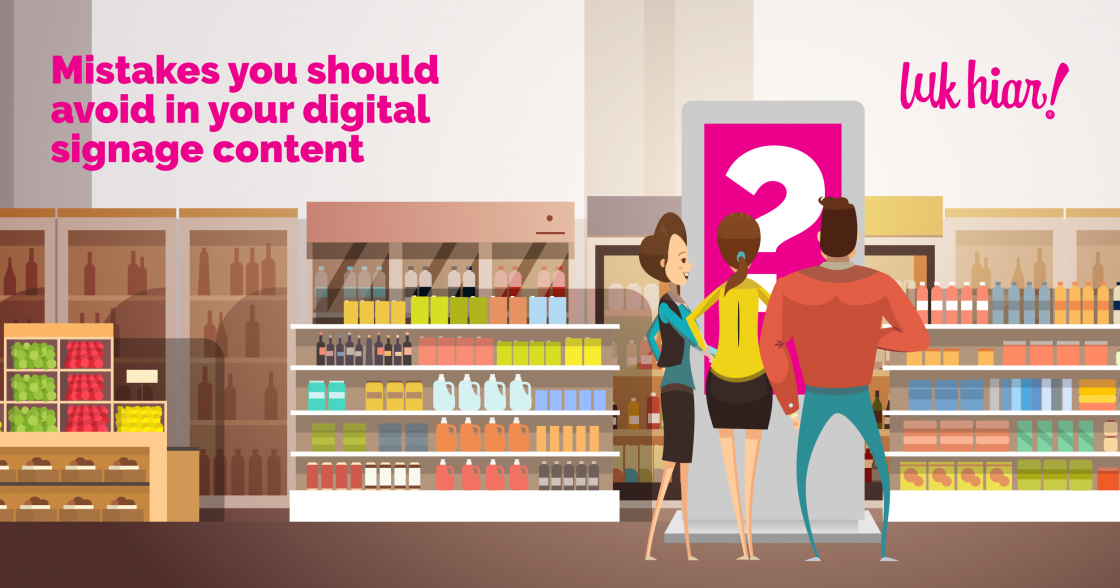
You have decided to implement a digital signage strategy, you have already created your content, but… something is not working as it should. The first step? See if you are making any mistakes in your content. Projecting the right message is essential if you want your campaign to work.
The first thing you have to take into account, a very important thing, is that digital signage screens are not televisions. They are placed in supermarkets, on the streets, in different stores… and this implies one thing: people are not going to stop for more than a few seconds to consume this content. Therefore, the first mistake would be hoping for your audience to wait and see the end of a one-minute spot. The content has to be fast, shocking and dynamic, with a concise message conveyed in a few seconds.
A pixelated image, for example, would be a clear example of the mistakes we are talking about, but it is not the only one.
A text that is too small or has little contrast with the background would also result in a lack of understanding of the message. You have to take into account that the viewers will not make an effort to read your content; you have to make it easy for them to simply receive it.
On the other hand, try not to have text all over the image. The only thing you will achieve with this is confusing content. Similarly, images with too much movement have the same result: making the user look away. Dynamic content usually works better than static content, but always in the right measure.
Don’t use texts that are too long. It is important that you communicate a clear message in a few words, so it can be read in a few seconds. And, of course, you should end with a call to action that makes your intention clear.
Using personalized images is always a good idea: they provide valuable content about your business and draw more attention than other images similar to those we have already seen in competing campaigns.
In addition, you should always avoid reusing content that you have made for other media. It will give you better results to create specific content for digital signage: as we said, short, dynamic and impressive.
If you place the text at a point where the sun reflects, for example, your message will not arrive. You will not get a good result for something you could have avoided by changing the location of the screen or at least by changing the location of the text. Easy, isn’t it? As you can see, it’s simply a matter of paying attention to small details that are not as insignificant as they seem!
And now, are you ready to boost your digital signage campaign? Contact us!
Times Square, Piccadilly Circus, Plaza Catalunya or any other busy avenue have something in common: they are all excellent advertising spaces. Companies with buildings…
The restrictive measures related to the pandemic are gradually being reduced, and that is great news for the retail sector. The time has come…
Digital signage, otherwise known as DOOH communication, came to stay at the top of the list of new media. Its possibilities in the business…